Tutorial
Download your files
To download you files click here. The file is a compressed folder. Make sure you expand it.
Connect to a file
- Click on “Connect to Data”.
- Then, “To a File” -> “Text file”.
This two step will connect your workbook to a .csv text file. But you also connect to an Excel file, a PDF or a spatial file.
- Locate the file
ex01_gender.csvand open it. - To connect to an additional file, next to “Connections” click on “Add” (and then redo steps 2. and 3.)
Join two tables
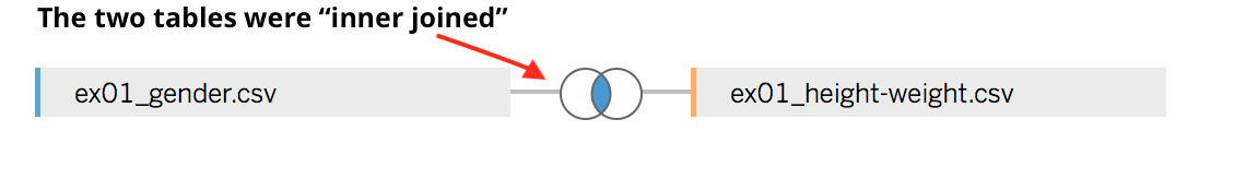
Sometimes, your data is scattered in more than just one table. In this example, for each observation (i.e. person) we have Gender in one table and the Weight and Height in a different table. To join the information from the two tables, we need a column with a unique ID. In this example, that column is labelled, not surprisingly, id.
After you connect to your files, Tableau will automagically join two or more table if it identifies a common unique ID column. You can check on which columns the tables have been joined (or change the join columns) by clicking on the symbol connecting the two tables.
For more details, see the Tableau documentation
Visualise your data
Visualise the count
If you want to count how many females and males you have in your data,
- Go to your worksheet (probably called “Sheet 1”).
You should now see you data on the left with a list of your “Dimensions” and “Measures”.
- Drag-and-drop
Genderin the “Columns” bar. - Drag-and-drop
Genderin the “Rows” bar. - Click on the little triangle on the right of “Gender” in the “Rows” bar.
- Select “Measure” -> “Count”.
Not that exciting, we have 5k records for each Gender.
Visualise the average
- Remove the “CNT(Gender)” from the “Rows” bar by drag-and-dropping it somewhere else.
- Drag-and-drop
Height(orWeight) from below “Measures” in the “Rows” bar.
Automatically, Tableau will sum all the values. So you can see now what is the total height (or weight) calculated by summing all the heights (and weights) in the data. This is not very interesting. Let’s instead calculate the average for male and females.
- Click on the little triangle on the right of “Height” (or “Weight”) in the “Rows” bar.
- Select “Measure” -> “Average”.
Visualise the distribution of your measures
It’s always important to have a sense of the distribution of a measure before you start analysing it.
- Make sure your “Columns” and “Rows” bars are empty: drag-and-drop any content away.
- Click on
Height(orWeight) from below “Measures”, on the left-hand side of the window. - Click on the histogram view on the right-hand side of the window.
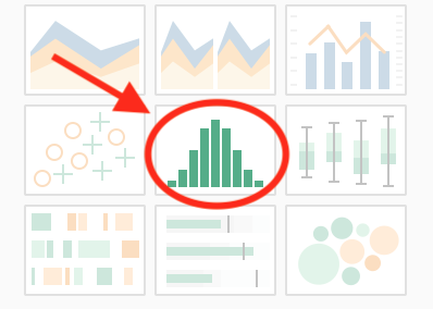
- Drag-and-drop
Genderin the “Rows” bar.
Do you understan what you see?
Export your view
To export the visualisation you have created you can
- Click on “File” in the menu bar, then “Export as PowerPoint…” -> “Export”.
Geographic data
Connect to the data
ex02_gdp-capita.xlsx(connect to an “Excel file”)ex02_NUTS_RG_10M_2016_3857_LEVL_2.shp(connect to a “Spatial file”)
Join the tables
Tableu will not be able to join the two tables. You will need to do it on your own.
- Select
geoon the left side of the “=” sign. - Select
NUTS_IDon the right side of the “=” sign. - Close the “Join” windown
Your table should now be joined!
Change the data type of a column
The column value was loaded as a string (“Abc”). We need to consider it as a number.
- Click on “Abc” in the header of the “value” column.
- Select “Number (whole)”.
Visualise the geographic data
Let’s go to the “Sheet 1” tab.
- Drag-and-drop
Geometryfrom below “Measures” where you read “Drop field here”.
You should now see the map of Europe.
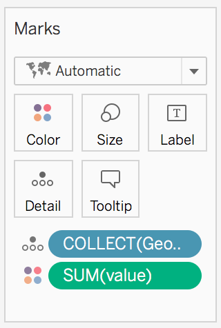
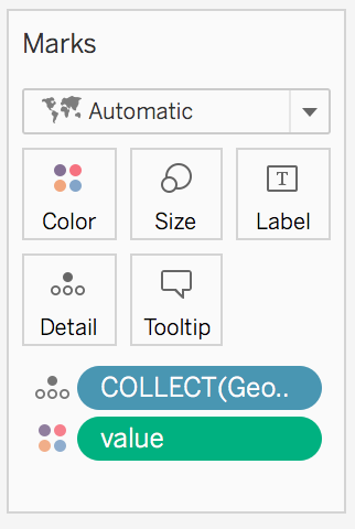
Make sure that value from “Sheet 1” is below “Measures”. If you find it below “Dimensions” you will need to Drag-and-drop it from “Dimensions” to “Measures”.
- Drag-and-drop
valuefrom below “Measures” to on the map. - In the “Marks” box change what is coloured in the map by clicking on the little triangle: from “Measure” -> “Sum” to “Dimensions”. This because you don’t want to see the sum of the value but the actual corresponding value for each region of the map.
Change the colors
- Click on “Color”.
- Set the “Opacity” to
100%. - Click on “Edit Colors” to change the colors.
Filter the values
The contrast between the different regions is not very strong because there is an outlier. To remove the outlier from the visualisation
- Drag-and-drop
valuefrom below “Measures” to where you read “Filters”. - Click on “Next”.
- Move the slide to somewhere below 100,000.
- Click “OK”.
Now all the values above 100,000 have been removed!